Data Analysis
Types of Epidemic Curves (Please see Giesecke, ch.12)
An epidemic curve is defined as a plot of the number of cases against the time of onset of disease, with time on the horizontal x-axis and the number of new cases on the vertical y-axis. It is a method of visualizing the progression of a disease over time which helps epidemiologists answer several important questions:
- What was the mode of transmission?
- When were the cases first exposed?
- What was the incubation period?
- Is this a point source epidemic or a propagated epidemic?
-
What is the nature of observed cases?
- Primary cases (persons initially infected from a point source), and
- Secondary cases (person-to-person transmission from primary cases to others)?
In fact, our plot of the number of cases against the date of onset would be an example of a histogram (a row of columns). If we fit a line to it to show a trend, we will obtain an epidemic curve. This curve has some very specific and useful properties described below. The shape of the epidemic curve is determined by the epidemic pattern (point source vs. person-to-person spread), the period of time over which susceptible persons are exposed, and the minimum, average, and maximum incubation periods for the disease.
Point source epidemic:
In a point source epidemic, all members of the population at risk are exposed to the causal agent over a short period of time. The incubation period may vary among exposed individuals, reflecting differences in the intensity of exposures and/or differing immune responses among the exposed. The epidemic curve in a point source exposure commonly follows a log-normal distribution, in which the number of cases increases rapidly, reaches a peak, and then gradually tapers off, creating a right-skewed curve, or a curve in which the mode (or highest point of the curve) is shifted to the left of center.
In a point source epidemic, the shape of the epidemic curve, or the distribution of the cases over time, can reveal important clues about the type of exposure and the incubation period, and may offer hints as to the causal agent at work. Three elements of the point source epidemic curve are of particular importance: agent, incubation period, and date of exposure. It is noteworthy that given any two of these elements, we will be able to make inferences about the third element. This is typically known as 'two out of three" rule.
The following example shows a plot of the distribution of cases over the outbreak period.
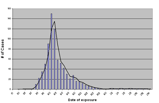
Assuming that a new point source outbreak will follow a similar lognormal distribution allows us to predict the projected severity of the epidemic in near real-time. For example, if in the above graph we only had information on the number of new cases through 11/15, we could fit a lognormal curve to the data we have accumulated and use it to predict the expected duration of the outbreak. Assuming a lognormal distribution also enables us to calculate the median incubation period by plotting the graph on a lognormal scale and establishing the peak.
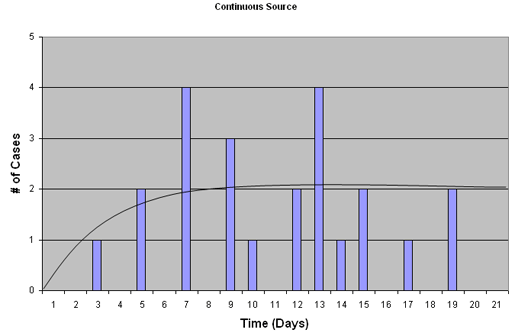
Other types of epidemics lead to different epidemic curves. For example, in a situation where drinking water is being polluted, or some food source is being continuously contaminated, we may see a characteristic Continuous source epidemic curve (see below) in which the number of cases rises, and plateaus rather than tapering off (as in common-source above) when exposure ceases. In this situation no information on average incubation periods can be obtained, since the time of exposure is continuous and is therefore not known for each new case.
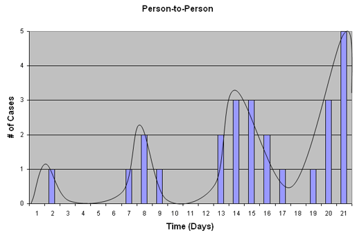
Person-to-Person Transmission (Propagated epidemic)
In a situation involving person-to-person mode of transmission, the epidemic curve will appear to have multiple peaks as wave after wave of infection spreads through a population, as shown below. In this example, cases in one peak may be sources for cases in a subsequent peak. If the incubation period and the infectious period are similar, peaks may, on average, be separated by one incubation period.
The Epiville Epidemic Curve
See the complete list of cases which appeared in the Amoy Apartment Complex and at the Star Hospital.
By plotting the number of cases which occurred on each day of the Epiville SARS outbreak, we can generate the following plot .
Now try to label the cases so that you can distinguish between cases which were identified at Amoy Apartment Complex and those from Star Hospital. Also, try fitting a line to the histogram to obtain an epidemic curve .
2. Based on histograms 1 and 2 and the following assumptions, estimate the incubation period range for the entire Epiville SARS epidemic.
- The first SARS exposure took place at the Amoy Apartment Complex Luau party on 8/1
- The first SARS exposure took place at the Star Hospital on August 3rd with the admission of an elderly patient from the Amoy Apartment
3. Should we combine cases from the Amoy Apartment Complex and Star Hospital? Why or why not?
| Amoy Apartment Complex Outbreak | Star Hospital Outbreak | |
|---|---|---|
| Number of people at risk | 600 | 110 |
| Number of SARS cases from 08/03-08/23 | 66 | 22 |
| Number of deaths | 12 | 3 |
| Number alive / ill | 54 | 19 |
4. Calculate the primary attack rate for the outbreak in the Amoy Apartment Complex (hint: 65 residents of the Amoy Apartment Complex were hospitalized at the Epiville General Hospital and 1 resident was hospitalized at the Star Hospital).
none: 65+1 = # cases of SARS at Amoy Apartment Complex
600 = # at risk (residents of the Amoy Apartment Complex including those that came to the luau party and those who did not
(66/600)*1,000 = 110 cases of SARS per 1,000 population at risk of SARS
Note: this is the same answer you obtained for the incidence calculation in SARS 1 study.
5. Use the following equation to calculate the secondary attack rate using the data for the Star Hospital.
none: 23-1 = # cases of SARS at the Star Hospital
111-1 = # at risk (employees of the Star Hospital who came in contact with the index case - an elderly man from the Amoy Apartment Complex)
((22) / (110))*1,000=200 per 1,000 population at risk of SARS

Another useful measure is the Case-Fatality ratio . The case-fatality ratio tells you what percent of people diagnosed as having a certain disease die within a certain time after diagnosis. Case-fatality (usually expressed as a percentage) is the proportion of cases ending in death compared to the total number of cases of the disease within a population. The higher the case-fatality the more deadly the infection. (See Giesecke, p.11)
6. Perform the following calculations using the data in the tables provided above:
- Calculate the case-fatality ratio for the Amoy Apartment Complex assuming the only fatalities from the disease are those who have already died; all currently infected subjects will recover.
-
Calculate the case-fatality ratio for the Amoy Apartment Complex assuming the following:
• Outcome of all infections is unknown
• Out of the 66 people WHO got sick, 12 died
• Out of the remaining 54 sick patients 34 recovered and 20 patients are still ill as of August 23rd and their outcome (recovery or death) is unknown. -
Calculate the case-fatality ratio for the Star Hospital assuming the following:
• We know the outcome of all infections.
• All infected subjects recover -
Calculate the case-fatality ratio for the Star Hospital assuming the following:
• Outcome of all infections is unknown
• Out of the 22 people working at the Star Hospital who got sick, 3 died
• Out if the remaining 19 sick personnel 5 are still ill and the outcome of their illness in unknown.
7. Based on what you now know about SARS, which is the most 'conservative' way of determining the case-fatality ratio? Should we calculate case-fatality assuming that those who are still ill will recover?
- A and C (in question 6) - assume all patients will recover
- B and D (in question 6) - exclude those with the unknown outcome from the denominator